I have used Movie maker to answer question number 7.
Friday, 4 March 2011
Wednesday, 2 March 2011
Using Quark to create my Double page spread
After previously using this software to create my contents page, i found it easier to use as i knew the correct tools in which i needed to use. Creating my double page spread was similar to creating my contents page due to using the same tools, however the text and the images had to be positioned and styled in a different manor to suit the codes and conventions of a double page spread. Below are a few screen shots of how i created my final double page spread.
Below is how i imported my image to the document. After uploading the image i then had to resize the image completely in order to meet the codes and conventions. Therefore i had to edit the image alot to create the desired size. I also changed the colouring of my image using the tools provided to make the image stand out more by making it look more effective.

Differently from my contents page i had to create 3 columns for my text. I used the tool bar situated at the bottom of the picture and changed the number of columns to 3. I also included a drops cap at the beginning of my article to make it look more professional but to also follow the codes and conventions.


Below is my final version of my of my double page spread.


Using Quark to create my contents page
Using Quarkxpress to create my contents page proved difficult due to me not using it before. However, it was easy once i picked up all the techniques to create my desired effct. Below are some tools i encounted to create my finished contents page.
These are the following tools i used to create my contents page.
The following images were used on my contents page.


I used the 'A' tool on the tool bar shown above to create my text, i then changed the font style, colour and size to suit my desired design.

After taking several photographs for my contents page i then uploaded them to my computer using a usb cable. To import them onto my document i drawn a box using the image tool on the tool bar, i stretched it to my desired size and then right click and imported my image. If my image was too small or too big i would resize it by dragging it to an approved size, then simply clicking "scale picture to box".

After importing my text i then added detail in order to form to the codes and conventions, i simply created a red thick line using the shapes tool, to place underneith the page references in order for them to stand out. I then copied and pasted them to suit the positioning of the text.


Here is my final version of my contents page. After using all the tools above to create my document i now feel confident when using Quark if i were to come across it in the future.

These are the following tools i used to create my contents page.

The following images were used on my contents page.
I used the 'A' tool on the tool bar shown above to create my text, i then changed the font style, colour and size to suit my desired design.

After taking several photographs for my contents page i then uploaded them to my computer using a usb cable. To import them onto my document i drawn a box using the image tool on the tool bar, i stretched it to my desired size and then right click and imported my image. If my image was too small or too big i would resize it by dragging it to an approved size, then simply clicking "scale picture to box".

After importing my text i then added detail in order to form to the codes and conventions, i simply created a red thick line using the shapes tool, to place underneith the page references in order for them to stand out. I then copied and pasted them to suit the positioning of the text.


Here is my final version of my contents page. After using all the tools above to create my document i now feel confident when using Quark if i were to come across it in the future.

Tuesday, 1 March 2011
Using Photoshop for my front cover
After looking at my front cover in comparison to the codes and conventions of a magazine front cover, it didn't develope or challenge forms of codes and conventions.
Therefore, i took into consideration what needs changing in order to improve the appearence for my target audience, there for i asked various people within my target audience what works and what doesn't. The main reasons are as follows: The image, the colours and the coverlines.
After asking around my target audience i took into consideration what things they didnt like and changed them in order to fully engage my target audience into buying the magazine.

The following image shows you how i created my masthead in order for it to stand out for my target audience. I also stretched and re-sized the text box usinh "Ctrl T".

After getting feed back from my taget audience, they said that the central image didnt work due to the lack of colouring on the background making it look dull. Therefore, i took some more photographs (listed below).
After choosing my image for my front cover i then decided on creating my coverlines using the text box tool and the shape tool in order to customise the coverlines to suit my magazine style.

Production work
Below are rough drawings of my new layout for my magazine, i have changed the layout and images from my previous drawings due to my survey results therefore in order for me to fully attract and engage my target audience i have listened to their critisim to enable to design my front cover, contents page and double page spread.


Thursday, 20 January 2011
Photographs for my front cover
The following images were used on my old front cover, they are not suitable enough due to the lack of codes and convents desired for a front cover image. The following images were uploaded to Gifup.com to enable my pictures to be presented in a professional manor.

Gif animation maker
Gif animation maker
Saturday, 15 January 2011
Screen Shots of my front cover
After using the software Photoshop previously to produce my school magazine, i found it much easier to use as i was familiar with the tools. This was useful as i was able to produce mass peices of work at a fast pace therefore i was able to stick to my deadline.
Below are some screen shots on how i produced my finished front cover. Each image will show different stages in the manufacturing of the front cover with a brief description below.

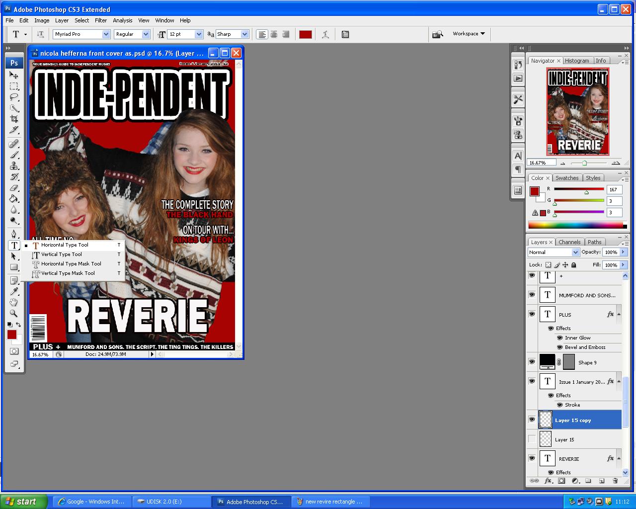
The above image shows the first stages of my title for my front cover. To achieve the text that is on the image i simply clicked on the "T" symbol on the left tool bar, i then clicked on the white blank canvas were i then typed my title "Indie-pendent" I then resized and change the font style to 'IMPACT' i changed the font size in order to make it run across the top of the page as i was clearly following the codes and conventions of a masthead. I then decided that i didn't want a basic masthead so then i took on a very difficult process were by i had to duplicate the layer so i was able to create a shadow behind each of the layers, this proved difficult however this is the finished masthead below.


After creating my title i then started to work on my central image. I originally started with a photograph taken from a digital camera which i loaded to the computer via a USB cable. I then uploaded the file to photoshop simply by clicking on "Import image" from then i started deleting the background using the "Select" tool and "Rubber" tool featured on the tool bar to the left hand side. This proved difficult to crop around the image as there were tiny areas i couldn't see properly, therefore i was able to zoom in using "Ctrl+" this was so i could zoom in to the percise area i wanted to essure i rubbed out the remains of the background.

After cutting out the background, i realised that the different levels of the four band members didn't work for the front cover, so i came to a decision were by i had to duplicate the layer by four were on each of the layers i was to leave one of the band members but get rid of the other three. E.g. on the layer above i cut out three of the band members leaving just one on the layer. To cut them out i used the "Polygon select" tool (featured bottom left) once i had cut around the image it would select were i have cut by producing a dashed line. (Bottom right) From then, i was able to press "CtrlT" to select the image to resize.


After cutting the central image and resizing the individual images i was able to apply the rest of the content. For me to create my headlines i simply clicked on the text tool on the left hand side "T" and clicked on the white A4 paper. After typing my text i then changed the font to "Stencil std" and changed it to a desired size. To create the shadow look behind my text i double clicked on the text layer to the bottom right which then appeared a box which i simply clicked on "Drop shadow". For my main cover lines i applied coloured boxes behind the text using the shape tool, i also applied the drop shadow to make them stand out. Also on the main cover lines i double clicked on the text layers and applied a white stroke.

Subscribe to:
Posts (Atom)